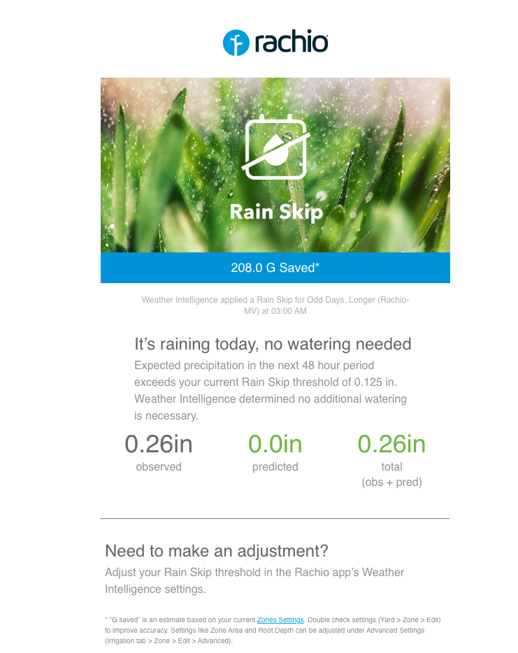
If you have multiple controllers, the rain skip email does not make it obvious which controller you’re referring to because the font is small and the text is light grey. A simple UX change to either the subject or the body would fix this. Here’s an example of the issue.
1 Like
Yeah, that also is annoying to me!
I’ll have the engineering team make that change in the next day or so ![]()
![]()
1 Like
I’ve been getting a mix of old and new format emails for about a week, so maybe that template didn’t get pushed to all servers? @franz
Interesting, we haven’t made any changes yet or deployed any new templates, the design team is working on reviewing those templates.
Can you share the differences you are seeing?
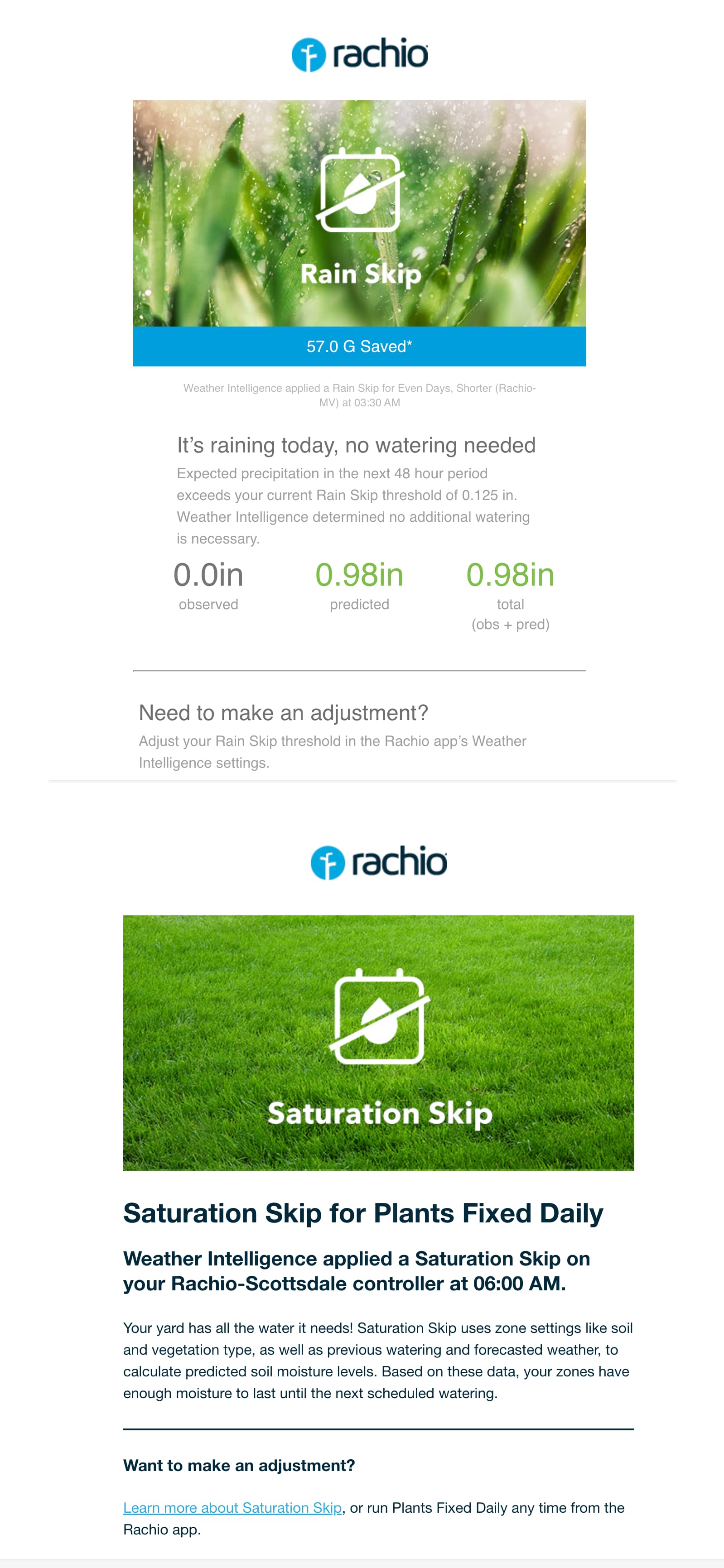
Aw yes, that explains the difference ![]()
I’ll let you know when the design team has approved the rain skip templates and we have modified that code.
![]()