It would be great if the depletion graph showed the depletion and the allowed depletion to give a better visualization of the water status.
I presume you are referring to the “Soil Moisture” graph and table? If so, I am not sure what you are looking for on it.
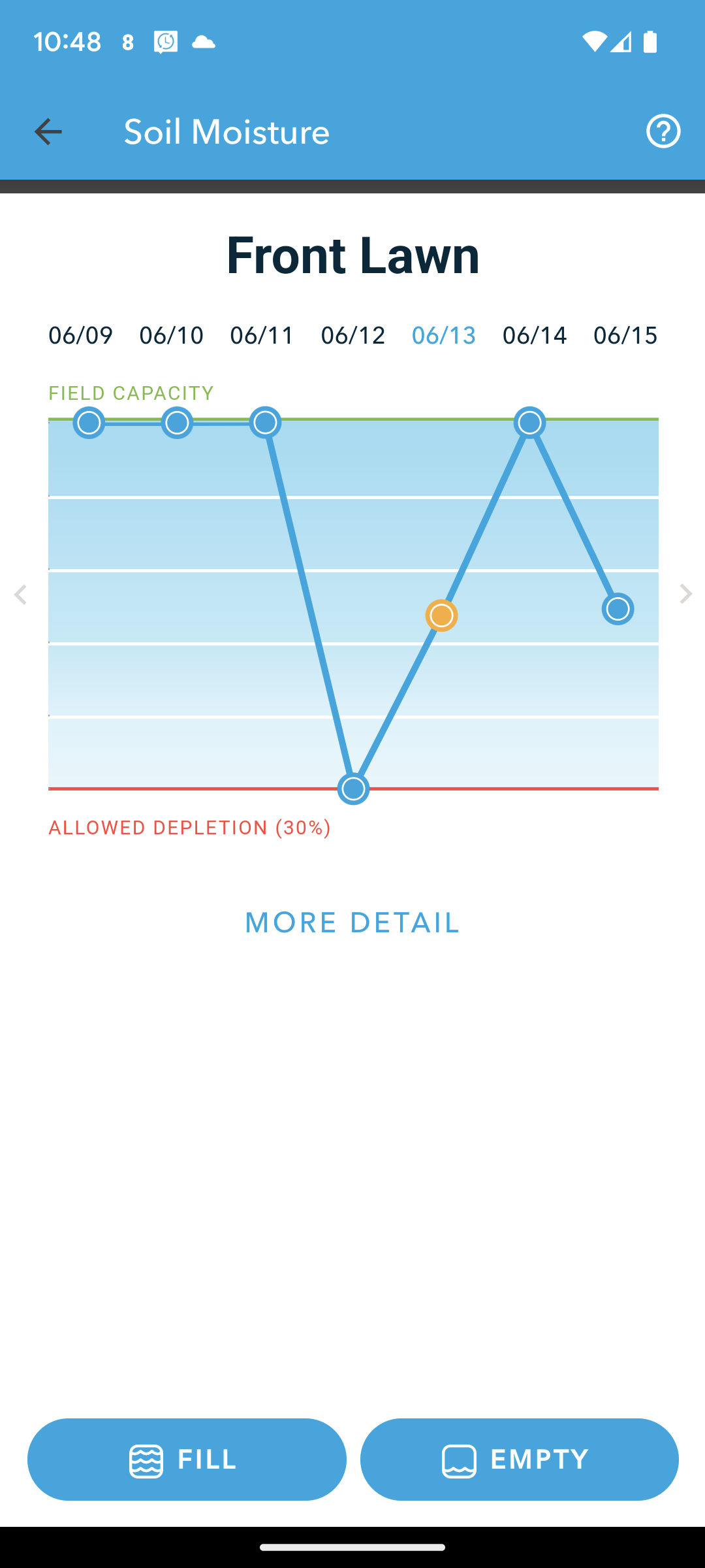
The visualization shows the water level relative to the allowed depletion but doesn’t show what the allowed depletion level is compared to the total saturation. Having the full picture would be helpful to understanding the meaning of the setting.
Total saturation is the green line at the top. If that is considered a 100% moisture, bottom line is 100 - 30, in other words 70% of the total moisture the ground is expected to hold. Your controller will keep the total level between 70 and 100%, and reports this range as 0 to 100 of the available moisture that it can control.
3 Likes
Thank you for the explanation. This definitely helps my understanding of what I’m looking at. I do still think the visualization could be improved. ![]()
Sorry that I did not point out the parts that @Gene did. I was tired, know about those things, and thought you must be talking about something else. You are correct, improvements can always be made.