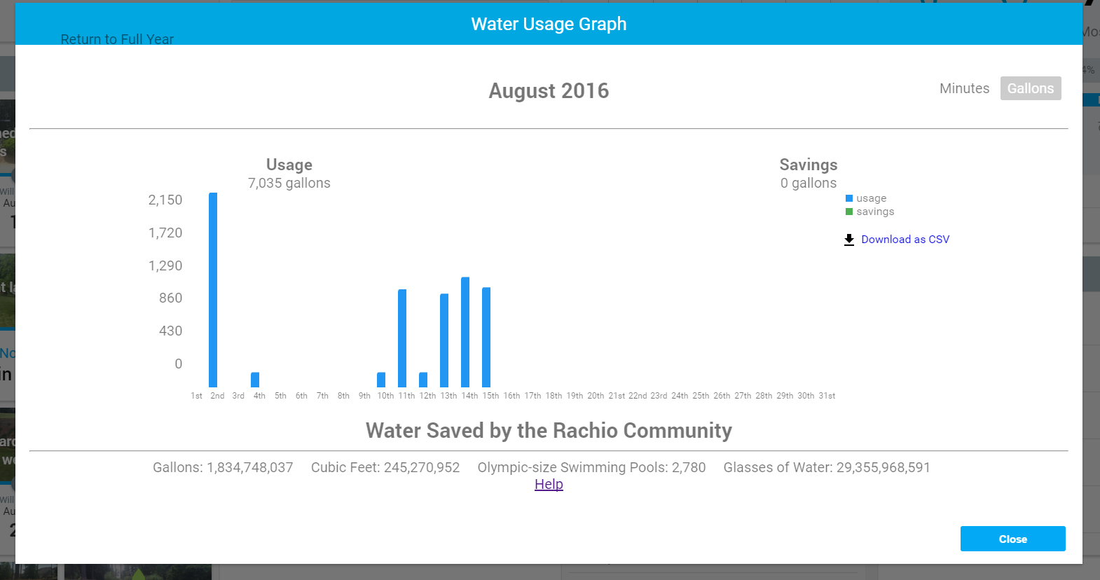
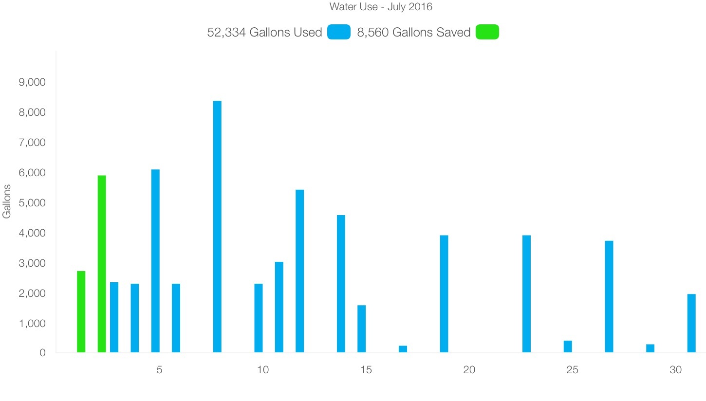
I use the watering history graph normally in the morning after irrigation to chart my daily consumption. The chart and underlying data are a bit goofy, as of the first attempt it normally misses one to three of the last calendar days (example of this morning , August 18):
I know this is not a debilitating problem, but hopefully an easy to fix glitch. It is annoying since it can take me up to 10 minutes every day to get to my real data. Am I the only one having this problem?
Thanks for having a look at it when you have a minute.
Heiri
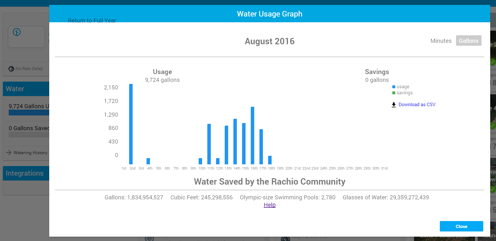
We are transitioning to a new reporting architecture in the next couple of weeks. The current service we are using is sometimes overloaded and needs to be retried.
After this transition reporting should be much more consistent and reliable.
I’ll post to the forums when this transition is finalized.
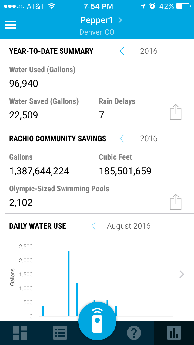
@hgugger, I’m not sure if you’ve checked out the reports on the mobile app, but they usually load faster – might be an easy work around until the new reporting architecture is available.
You can also take quick snapshots of the reporting from the mobile app to view on a larger screen:
@franz thank you for the info about new reporting system, to which I look very much forward! I quietly hope you include the ability to export and/or back up all the settings… @emil yes I use the mobile screen you show here. A feature I really like is that when you press a bar long enough, the numeric value comes up. Very neat. I sometimes use it for my water usage charting, when I can’t get to it on Windows…
Thanks both for the quick response and good info!