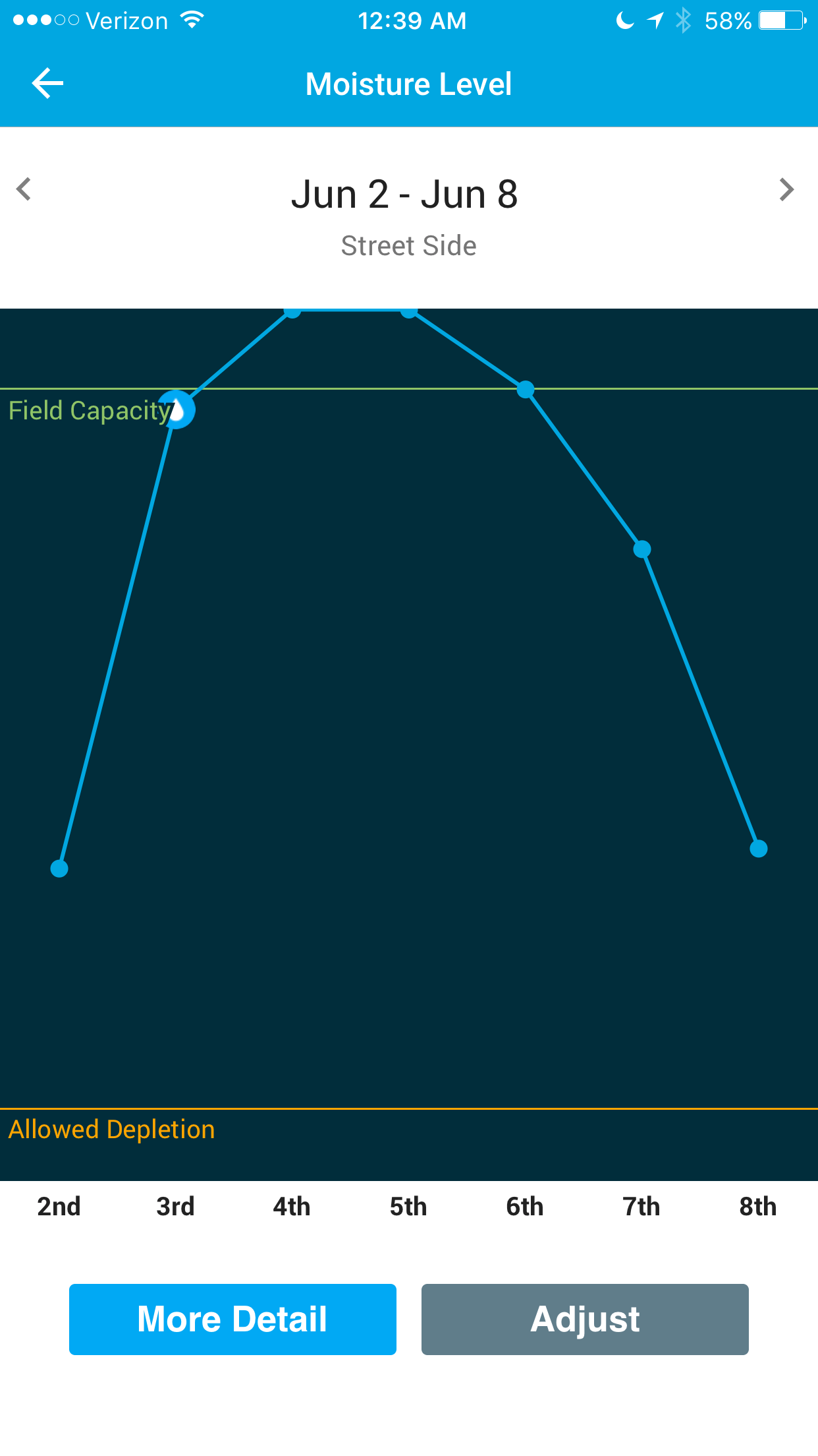
Why does it visually appear to water before hitting allowed depletion?
I may be overlooking something stupidly obvious and hopefully someone corrects me.
Longer dorkier version…
In the moisture level charts there is the orange Allowed Depletion line going across the X-Axis of Time. Yet… I’m not sure what it is supposed to represent.
If you go into the more detail area it tells me the zone is 33% on June 2nd. The zone is configured for 50% allowed depletion. Is where the black meets the white above 2nd supposed to represent 0%, or is it the orange line above Allowed Depletion supposed to be 0%?
If the zone is 17% under Allowed Depletion on June 2nd shouldn’t the orange line be above the blue data point for the 2nd if the line were to represent 50% as the configured allowed depletion amount?
From 895 (end of black shaded area) to 295 (field capacity) we have 600 rows of resolution.
33% of the way from the end of the black shaded area to field capacity would be pixel row 695.
50% of the way from the end of the black shaded area to field capacity would be pixel row 595.
Neither value really aligns with the blue dot’s location for June 2nd which appears closer to 650-660.
However, from 840 (orange line) to 295 (field capacity) we have 545 lines of resolution.
33% of the way from the orange line to field capacity would be pixel row 658.
50% of the way from the orange line to field capacity would be pixel row 567.
658 is spot on for where the blue dot is represented. That seems to indicate the orange line is 0% moisture.
I guess that begs a further question. Does 0% represent zero moisture in the ground, or does it represent we have hit the floor of the configured allowed depletion value? In other words we can’t go down more because we’ve arrived at the configured 50% allowed depletion. If the moisture level were 5% we’d actually be +5% from the configured allowed depletion rate, 55% in this instance.
It made sense @scorp508, and this is actually something people get confused on quite a bit when it comes to moisture graphs. The orange allowed depletion line is whatever you have configured the allowed depletion to be. So if it’s configured 50%, that represents 50% of your soil moisture. When we say your zone is at 33%, this is 33% of the 50% allowed depletion. This percentage of a percentage business can easily trip people up. Does my description help?
Yes… it makes sense I suppose. However I would kindly suggest the choice of graphical representation is poor. I’ve always been of the opinion if you have to spend a bunch of time explaining what a chart means, then it’s a poor chart to begin with.
Is the below correct? In my case it sounds like the reported 33% was actually 66.5% of total moisture in the soil when my AD value is configured at 50%.
Personally I’d rather see 0% to 100% (though you do burst to 111% today) properly scaled on the chart’s Y-Axis at top and bottom. Then, place the allowed depletion line at wherever it is set for the zone. To my feeble mind that offers the clearest glance-and-go data on the chart with little to no opportunity for misunderstanding.
Are the advantageous reasons for using the current model?
It’s funny because I had this conversation pretty recently with some of our internal team. I think we would like to try to show a more intuitive graph in the future. The main drive for the current design is that we do not track below your allowed depletion level, so if your zone ever hits that AD line and isn’t able to be watered for one reason or another (standby mode, rain delay, etc.) we would just have to bottom the graph out at the AD line, which felt strange.
I completely appreciate the reasoning behind it. I have similar conversations with devs and PMs on a frequent basis. The idea being a product made for the common consumer needs to be understood by them as well. The way this chart currently presents… isn’t quite there IMHO. Another way to simplify it may be to just change how moisture is reported across the apps. Instead of the calculated “33%” above allowed depletion just say what it actually is, 66.5% in this case. At least then a human can quickly connect a reasonable understanding of what the level is and how close to allowed depletion they are though you may need to toss the configured AD number into the chart’s Y-Axis next to the orange line for it to make sense.
Heck if you want to toss a few skulls, crossbones, and parched withered looking plants gasping for water in the graph area <20% I’d be cool with it.
Maybe just a giant label that says “DANGER ZONE” too
I think the graph has some room for improvement. My initial goal would be to get more people using flex, and then improving the graph becomes a bigger need. However, I think the moisture graph could be improved in a way that motivates more people to switch to flex as well, so it’s a bit of a chicken and egg problem.
Oh well now the opportunities are endless! If Kenny Loggins face shows up on my phone with danger zone playing because the moisture levels are too low I just may have to throw money at the screen.
Any chance you could finally take this up? It confuses me every time I go to change it. The term makes sense, I adjust AD lower because the lawn is drought stressed, then the graph makes me think I’ve done it in reverse. I go back and adjust it the wrong way and make things worse. Then I end up back on the support site and this forum to figure it out.


 )
)

