I’m probably going to get this product soon, and decided to “try” the app using the demo account. I have some suggestions for app design and flow.
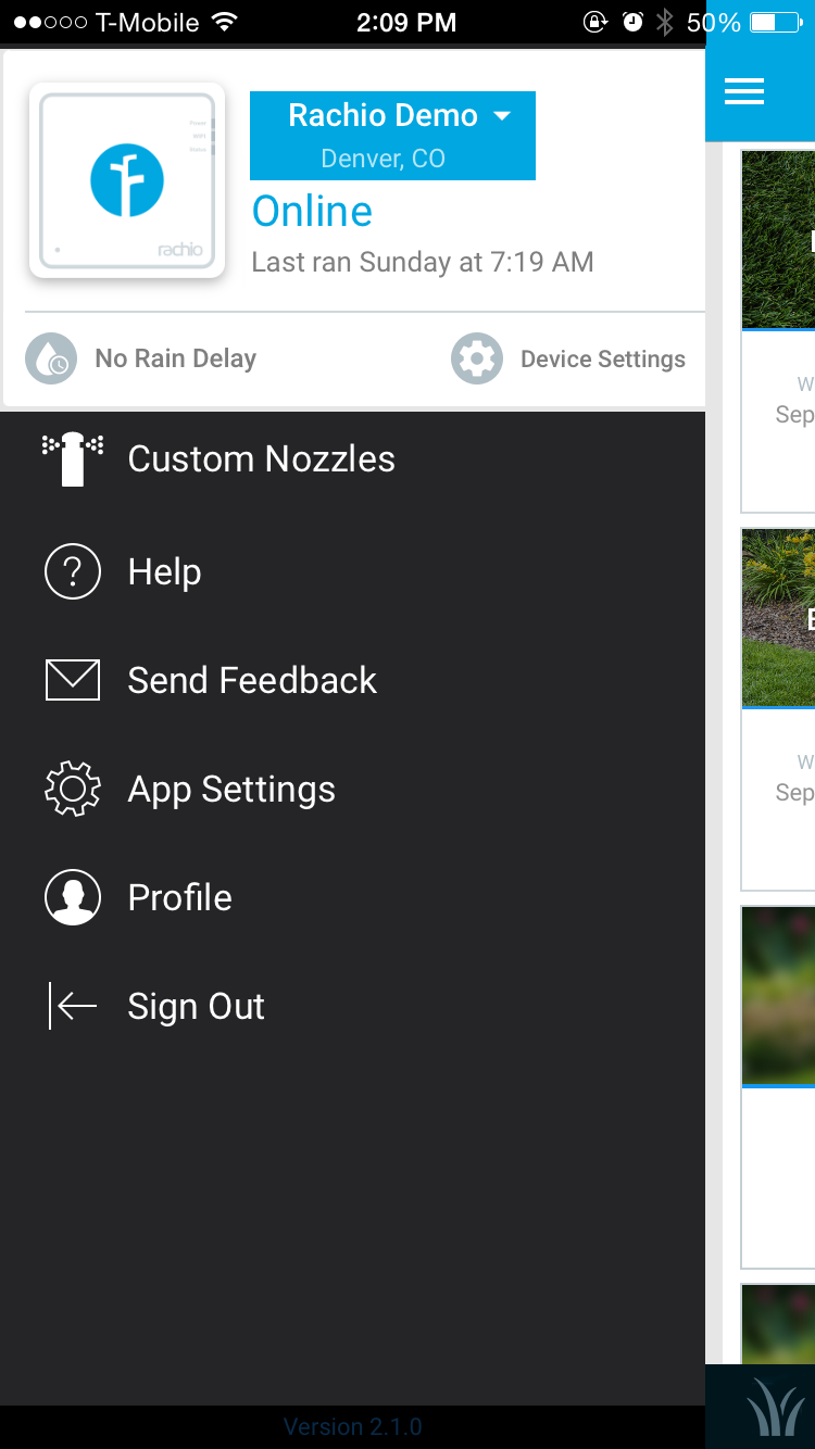
No need to show the device on the main page. That’s a lot of space to take up just to show it’s online.
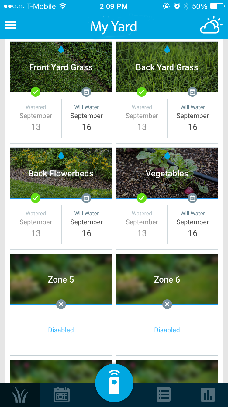
Allow a user to reorganize the panels on the dashboard. I don’t want to see device status or weather up top.
The support tab on the bottom bar is redundant. The same thing exists in the side menu
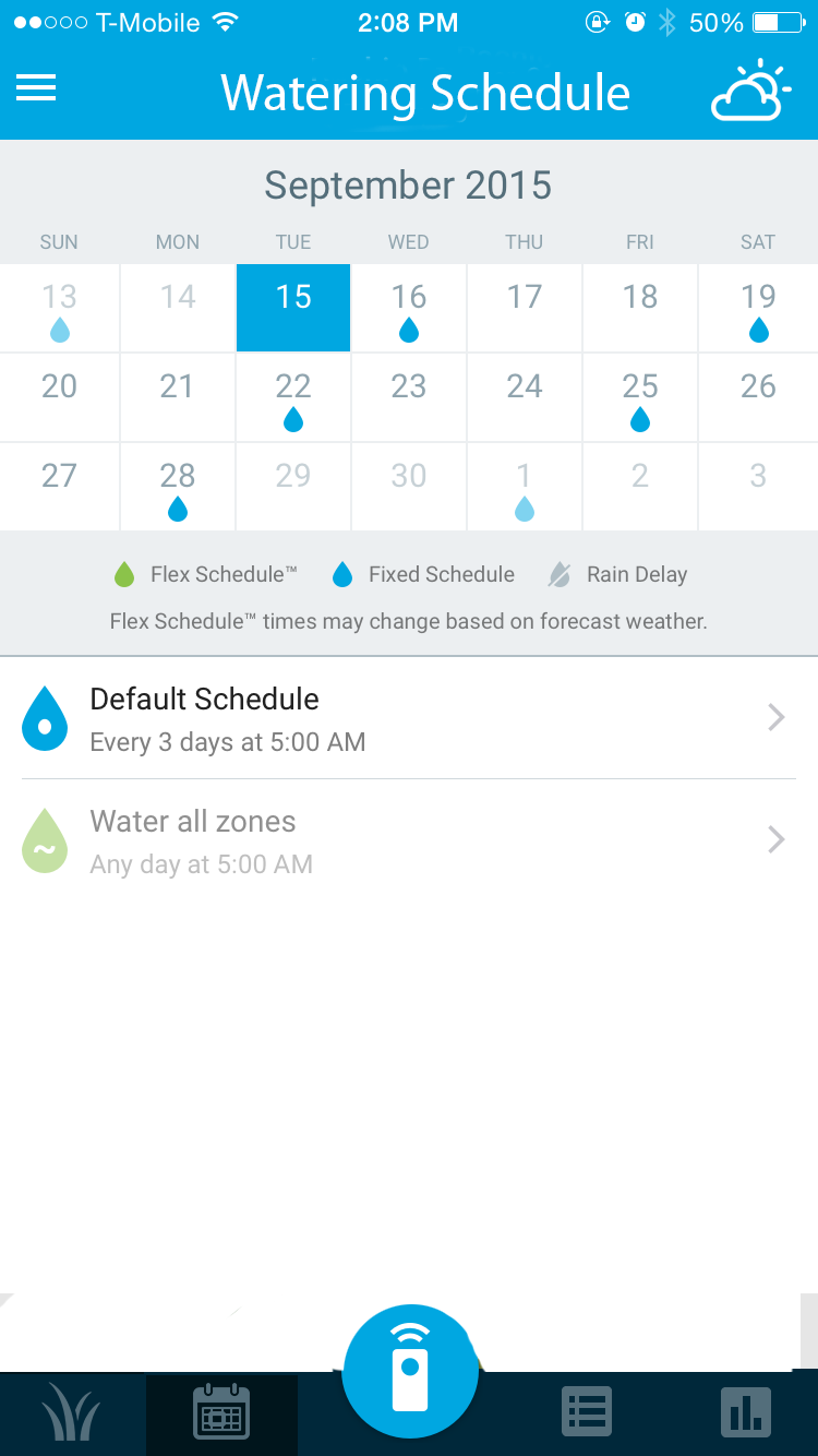
Even better than the ideas I listed, I’d like a redesigned flow. A new main screen that shows the zones, with the other tabs being scheduling, activity log, and analytics. The weather can be it’s own page as well, accessible from the top right corner. Here are some mockups (I’m not a pro at photoshop, sorry):
Stuff like device status and account info and all that can be moved to the side menu as shown (again, i just moved stuff around in photoshop, so it looks ugly):
I like the current app’s functionality and style, but these changes I think would make it simpler and cleaner. I also like that Rachio seems to have a good community, support base, and development speed. I’m considering moving to Rachio from another product whose app and features are moving much too slowly for my needs (Lono). Anyways, hopefully this feedback will be considered and possibly implemented.
Hey @Ry_L, thanks so much for the suggestions! In particular, really appreciate you taking the time to mock up your ideas. It’s folks like you that make the community so great.
Redesigning the app takes a considerable amount of time and effort, but as we move forward, we’ll definitely take these ideas into account.
As a relatively new current user, who travels a lot, here is my 2 cents.
I have had problems with my internet. I really like seeing that my internet connection is online and working. It’s important.
While allowing users to reorganize panels would be a nice addition, it should be low on the priority.
IMHO, I would rather see minutes than gallons on the graph page on the app. Gallons means I have set up my area sizes correctly, which I have not, and it’s going to be a pain to do. Minutes watered makes a lot more sense to me. And I can only get minutes if I go to the web app,
@Ry_L - I too was disappointed in the Lono and gave up before even attempting to install. Purchased and installed a Rachio last weekend in 15 minutes. Setup was simple and zones were up and running in 15 minutes also (had to use my iPad since the ios9 on my phone does not work with the blink up, they are working on that).
It’s late in the season here (Michigan) and it’s watered a couple times without issue and skipped due to rain once. Seems to be working well.
I’m off to an optimistic start from 2 yrs of failures and delays from Lono.